
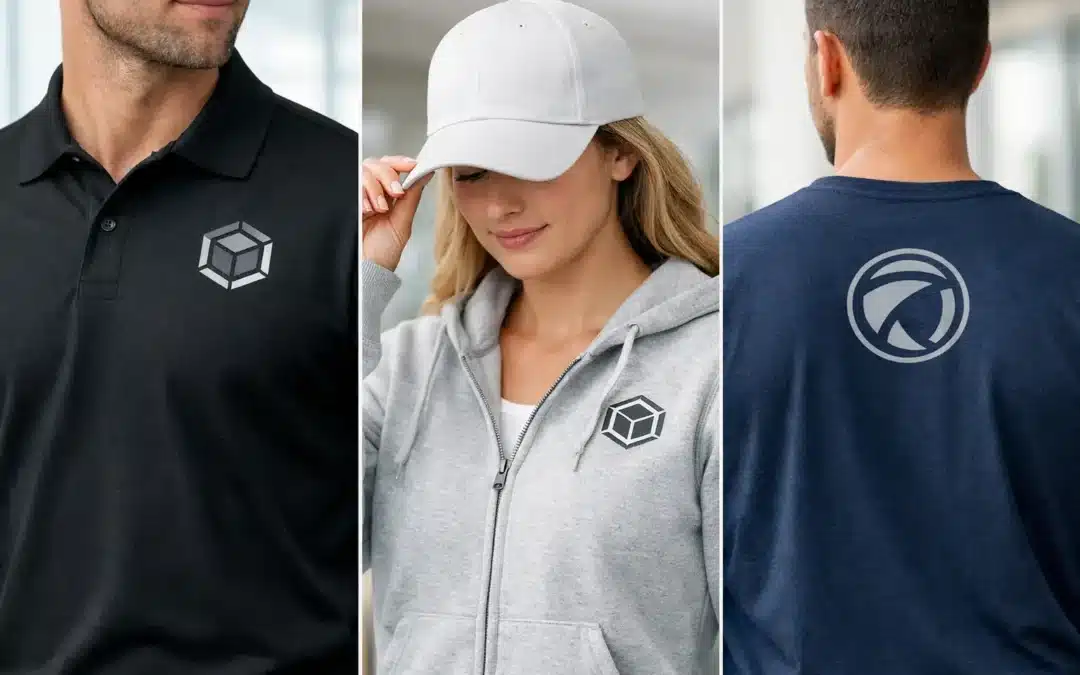
A polo with a logo positioned too low can make a polished team uniform look awkward. A large back print that disappears beneath a backpack, or a sleeve logo hidden by a jacket, can reduce the value of the garment before it has done any promotional work. Effective logo placement on apparel is not simply a design decision. It affects how often your brand is seen, how professional the wearer feels, and how well the decoration performs over time.
For Australian businesses, clubs, schools and event organisers, the best position depends on the garment, the occasion, the branding method and the job the clothing needs to do. A workwear shirt needs a different approach from a charity fun-run tee or a retail hoodie. Getting that detail right at the artwork stage avoids costly reprints and gives every item a more considered finish.
Start with the purpose of the garment
Before choosing a print position, decide where and how the apparel will be worn. Staff uniforms need clear identification from a comfortable viewing distance. Event shirts may need sponsors, volunteer roles or campaign messages visible in photos. Retail merchandise has to feel like something people genuinely want to wear, not simply an advertisement.
A small left-chest logo is a reliable choice for hospitality, trades, corporate teams and school apparel because it is familiar, neat and easy to recognise during face-to-face interactions. It also works across polos, button-up shirts, jackets, vests and many knitwear styles. The trade-off is visibility at a distance. If your staff work outdoors, at a busy event or around a large site, a back logo or additional sleeve detail may give the brand stronger exposure.
For campaign tees and sporting apparel, the front often carries the main message while the back provides room for a large logo, team name, sponsor list or event information. Think about what people will see when participants are walking ahead, standing in a queue or appearing in group photos. The most visible side is not always the front.
Common logo placement on apparel
There is no single correct location, but several positions consistently work well when matched to the garment and purpose.
Left chest for everyday uniforms
The left chest is the standard position for a reason. It sits naturally on polos, business shirts, hoodies, jackets and vests, and it gives a logo a professional, understated presence. It is particularly suitable for embroidered logos, where a modest design can look premium and withstand regular washing.
Keep artwork simple at this size. Fine text, small gradients and intricate illustrations may lose clarity when reduced for embroidery or print. A strong logo mark with readable lettering is usually more effective than trying to reproduce every element of a detailed brand lock-up.
Centre chest for a bold message
A centre-chest print is useful when the design itself is the feature. It suits promotional tees, fitness apparel, fundraising merchandise and casual team clothing. This location gives more space than a chest logo, so it can accommodate a campaign slogan, event graphic or larger brand identity.
Centre chest placement is less formal than a left-chest mark, and it can be uncomfortable if a very large or heavy print is used on lightweight fabric. Consider the feel of the decoration, especially for garments intended for active staff, volunteers or participants wearing the item all day.
Full back for distance visibility
A back logo is one of the most practical options for trades, delivery teams, security staff, events and outdoor crews. It remains visible when the wearer is moving away from customers, working on site or walking through a crowd. A large back design can also make a uniform easier to identify in a busy venue.
Allow room around the artwork. Positioning a design too close to the collar can make it look cramped, while placing it too low may mean it is covered by trousers, aprons or bags. The cut and size range of the garment matter here, particularly when one design must work across both unisex and women’s styles.
Sleeves, nape and side details
Sleeve logos are useful for secondary branding, sponsor recognition or a simple web address. They are often used alongside a chest or back design rather than as the only logo position. A nape print, placed below the back collar, creates a subtle retail-style finish on tees and hoodies.
These smaller placements can elevate the overall look, but they should not carry information people need to read quickly. A sleeve is curved, frequently in motion and partly hidden from view. Use it for a simple logo, icon or short text rather than a detailed message.
Match the placement to the branding method
The decoration method influences what is possible and what looks best. Embroidery is a strong choice for polos, jackets, caps and workwear, particularly for compact chest logos. It has texture and durability, although very fine detail and large stitched areas can be unsuitable or costly.
Screen printing is effective for larger designs and solid colour artwork, especially on tees, hoodies and event apparel. It delivers strong colour coverage and can be economical for higher quantities. Digital printing can suit full-colour or more detailed graphics, while heat transfers are practical for names, numbers and short-run personalisation.
The fabric also changes the decision. High-visibility workwear, stretch performance fabrics, fleece and lightweight cotton all behave differently under print or embroidery. A design that looks excellent on a cotton tee may need adjustment for a waterproof jacket or breathable sports polo. Confirm the intended garment before finalising artwork and placement.
Size matters as much as position
A logo needs enough scale to be recognised, but oversized branding can make a quality garment look promotional in the wrong way. This is especially relevant for office uniforms and customer-facing staff clothing, where a restrained result often feels more credible.
As a practical guide, a left-chest logo should be sized to suit the available area rather than pushed to the maximum width. Large back prints need to be legible from several metres away, with bold lettering and enough contrast against the garment colour. For sponsor-heavy event shirts, resist shrinking every logo until it becomes unreadable. Fewer, clearer marks usually create a better result.
Ask to see a visual mock-up before production. It should show the actual garment colour, decoration location and approximate scale. A proof is particularly valuable when the logo is being applied across several garment types, because the same artwork can look quite different on a polo, softshell jacket and hi-vis vest.
Consider colour, contrast and garment construction
A logo can be perfectly placed and still fail if it lacks contrast. Dark artwork on navy fabric, pale embroidery on grey marl, or a detailed full-colour logo on a patterned garment may be difficult to read. Where possible, use approved one-colour or reversed logo versions designed for dark and light backgrounds.
Watch for pockets, zips, seams, reflective tape and panels. Printing across these features can distort the design, affect durability or make the finished garment uncomfortable. Pocketed work shirts may require the logo to sit above the pocket, while a zip-front jacket might need a left-chest placement sized around the zip line.
Brand guidelines are useful, but they are not always written with apparel in mind. A capable supplier can help adapt the artwork without compromising brand recognition – for example, simplifying tiny text for embroidery or selecting a single-colour version for a practical workwear application.
Plan for real wear, not just the approval image
The people wearing the apparel should have a say, especially for uniforms. Consider whether staff will wear lanyards, safety harnesses, aprons, backpacks or name badges. These can cover chest branding and affect which placement delivers the best value. For winter uniforms, think about how branded outerwear will work with branded polos underneath.
It also pays to consider repeat orders. Choose a placement system that can be applied consistently as staff join, sizes change and garment styles are updated. Consistency builds recognition across your team, whether you are ordering 20 polos for a local club or coordinating apparel for a large event.
A clear brief makes the process faster: provide your logo files, garment preferences, quantity, deadline and intended use. If you are unsure where the artwork should sit, ABC2000 can help assess the garment, recommend a suitable decoration method and prepare a proof before production.
The best branded apparel does not shout for attention at every angle. It puts the right message in the right place, so your people look organised, your logo stays visible and the garment earns its place long after the event or first shift is over.