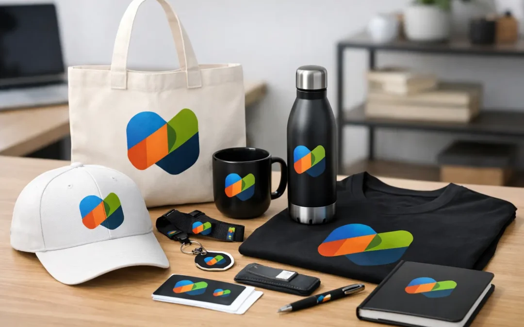
A logo can look excellent on a business card and completely wrong on a drink bottle, embroidered polo or event banner. That is why brand consistency across merchandise needs more than placing the same artwork on every product. It requires the right colours, print methods, product choices and production checks so people recognise your organisation wherever they see it.
For a business, school, club or event organiser, branded merchandise is often handled, worn and kept far longer than a brochure. A well-made pen, quality beanie or useful stubby holder can put your name in front of people repeatedly. If the branding is inconsistent, however, those products can dilute the professional image you have worked hard to build.
Why consistent merchandise builds confidence
Every branded item makes an impression. A staff lanyard tells people something about your organisation at reception. A mug sits on a client’s desk. A banner sets the tone for an event. Team scarves and embroidered caps create a sense of belonging.
When the logo, colours, type and overall presentation match across these items, people see a business or organisation that is organised and dependable. That matters whether you are ordering promotional products for a Melbourne trade show, school fundraising day, local sporting club or national campaign.
Consistency is not about making every item look identical. A lapel pin has different space and production limits from a tote bag or aluminium coaster. The aim is to make each product feel like it belongs to the same brand family. Your recognisable elements should remain clear even when the product, size or decoration method changes.
Start with the non-negotiable brand elements
Before selecting products, identify what must remain consistent. For most organisations, this includes the approved logo version, brand colours, fonts, slogan or campaign line, and the amount of clear space required around the logo.
The original logo file is particularly important. A low-resolution image copied from a website may look acceptable on screen but can print blurry, jagged or soft. Vector artwork, such as AI, EPS or print-ready PDF files, is normally the best starting point because it can be scaled for a small badge or a large display banner without losing quality.
Colour needs similar care. A logo colour shown on a mobile screen can differ from its printed result, and colours can also shift between paper printing, screen printing, embroidery and engraved finishes. Provide approved Pantone references where possible, along with CMYK values for print and RGB or HEX values for digital artwork. This gives your supplier a clear standard to work from.
It also helps to nominate one person or small team to approve artwork. Without a clear approval process, a club committee, office team or event group can unintentionally send several versions of the logo, each with minor differences. Those differences become very visible once they appear across a large order.
Match the product to the job
The most consistent branding starts with useful merchandise. An item that suits its recipient and setting is more likely to be kept, used and seen. It is also easier to brand well because the product choice supports the message.
For example, a construction business may gain more value from branded workwear, drink bottles, notebooks and durable keyrings than from novelty items. A school may prioritise caps, lanyards, badges and drinkware. An event organiser might combine banners, balloons, staff apparel, tote bags and attendee giveaways to create a coordinated look from entry to exit.
Consider where the item will be used. A premium engraved metal pen can support a corporate gift or recognition programme, while a printed plastic pen may be the practical option for a high-volume community event. Both can be effective, but they should reflect the same visual standards and the purpose of the campaign.
Budget is part of the decision, too. Ordering the lowest-cost item is not always the best value if it limits logo visibility, wears quickly or does not suit the audience. On the other hand, not every campaign needs a premium product. The right balance depends on quantity, expected lifespan, audience and how closely the item is associated with your organisation.
Plan branding for each decoration method
A design does not transfer in exactly the same way across all merchandise. Print area, surface shape, material and decoration method affect what is possible.
Screen printing can produce strong, clear colours on many fabric and promotional products, particularly when artwork uses solid colour areas. Digital printing can suit detailed or full-colour designs. Embroidery gives apparel, caps and beanies a durable, textured finish, although very fine text and intricate details may need simplification. Laser engraving creates a refined result on selected metal, timber and coated products, but it reveals the material beneath rather than reproducing full logo colours.
This is where a one-size-fits-all logo approach can cause problems. A detailed horizontal logo may work beautifully across a banner yet be difficult to read on a small keyring. In that case, an approved stacked logo, icon or shortened version may be the better choice. It should still use your established brand elements, rather than becoming an unrelated design.
Ask for an artwork proof before production. Check logo placement, dimensions, spelling, colours, contact details and the selected product colour. For large orders, event launches or products with a high perceived value, a physical pre-production sample can be worthwhile. It adds time and sometimes cost, but it can prevent a much more expensive issue later.
Keep campaigns coordinated without making them repetitive
A campaign can include several product types while still looking considered. Start with one core colour palette and use it consistently across the main items. Then choose a hero product or visual element that gives the campaign a focal point.
For instance, a charity fun run may use the same logo and primary colour across event banners, volunteer shirts, participant caps and water bottles. The shirts might feature a large event graphic, while the bottles carry a simpler logo lock-up. The visual language stays connected, but each product uses the available space properly.
This approach is useful for clubs and associations as well. Member merchandise, committee gifts, fundraising products and match-day displays do not need identical artwork. They do need consistent colours, logos and quality so members can immediately recognise them as official items.
Avoid overcrowding the product. A logo, website, phone number, social handle, event date and several sponsor logos may all be relevant, but fitting everything onto a small item can make the brand harder to read. Prioritise the message for that item. A business card can carry detail. A promotional pen may only need the logo and phone number.
Build a practical approval and reorder process
Consistency becomes easier when past decisions are recorded. Keep a simple merchandise specification for regular products. It can include the product name or code, preferred colour, approved artwork file, decoration method, print position, logo size and supplier proof.
This is especially helpful when different staff members place orders throughout the year. A new office administrator should not need to guess whether the company logo is printed in white or embroidered in navy, or which version was used on the previous run of uniforms.
For seasonal or recurring requirements, plan ahead. Schools may need merchandise before term starts, clubs before the season, and businesses before conferences or Christmas gifting. Early planning gives more choice in products and colours, allows time for artwork adjustments, and reduces the pressure of express production.
Working with one experienced supplier also makes coordination simpler. Rather than managing separate providers for apparel, signage, printed stationery and promotional gifts, you can keep artwork and product decisions aligned across the order. ABC2000 supports this process with a broad range of branded products, artwork guidance and production coordination, helping customers manage both everyday orders and larger campaigns with confidence.
Common consistency mistakes to avoid
The most common issue is using outdated artwork because it was the easiest file to find. Another is selecting a product colour that clashes with the logo or makes important text disappear. A dark logo on a dark cap, for example, may be technically printed correctly but fail to do its job from a distance.
Small text is another frequent problem. What looks clear on an artwork proof at high zoom may be unreadable on a badge, pen or embroidered garment. Simplifying the layout usually delivers a stronger result than forcing extra detail into a limited print area.
Finally, do not overlook product quality. A promotional item represents your organisation after it leaves your hands. If the print rubs away quickly, the drink bottle leaks or the banner material looks flimsy, people may connect that experience with your brand. Choosing products appropriate to the use, rather than only the unit price, protects the value of your investment.
The best branded merchandise feels intentional at every touchpoint. Start with clear artwork, choose products people will genuinely use, and give each item the right version of your brand. When the details are managed well, a simple pen, cap or banner can carry the same confidence as your biggest marketing campaign.