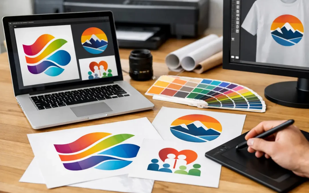
You can usually tell when the wrong file has been supplied before the job even goes to press. The logo looks soft around the edges, colours shift, or a simple badge design suddenly becomes difficult to reproduce on a banner, mug or polo. If you are asking what artwork files for printing are needed, the short answer is this: the best file depends on the product, the print method and how your logo was originally created.
For most commercial print work, the safest starting point is a vector file. That means formats such as AI, EPS or a print-ready PDF built from vector artwork. These files keep shapes, lines and text sharp when scaled up or down, which matters whether your logo is going on a lapel pin or across a large display banner. Raster files such as JPG and PNG can still be useful, but only when they are high enough quality and suited to the application.
What artwork files for printing are usually preferred?
In practical terms, printers and promotional product suppliers prefer artwork that can be reproduced cleanly without rebuilding it from scratch. Vector files are generally the first choice because they are resolution-independent. A logo in vector format can be resized for a business card, stubby holder or media wall without losing quality.
AI and EPS files are common because they preserve editable paths and spot colours. A print-ready PDF can also be excellent, provided it has been exported correctly with fonts embedded or outlined. These file types are especially useful for screen printing, embroidery digitising, laser engraving, vinyl cut lettering and most branded merchandise applications.
Raster files work differently. JPG, PNG, TIFF and PSD files are made from pixels, so their quality depends on resolution. A low-resolution logo pulled from a website might look acceptable on a screen, but once it is enlarged for print, the edges become jagged and the artwork loses clarity. That is where many delays begin.
Vector vs raster – why it matters
If your artwork includes a business logo, club crest, sponsor mark or event identity, vector is usually the right answer. It holds line detail, keeps text readable and allows colours to be managed more accurately. This is particularly important when branding promotional products across different materials such as fabric, ceramic, metal and plastic.
Raster files are more suitable for photographic images or designs with complex tonal shading. A product catalogue cover with lifestyle photography is a good example. So is a full-colour event poster with detailed imagery. In those cases, high-resolution raster artwork can print well, but the file must be prepared at the correct size and resolution.
This is where there is some trade-off. A vector logo placed into a low-quality Word document does not magically become print-ready. Likewise, a high-resolution PNG might be good enough for a small digital print run, but not ideal for signage or specialty branding methods. The right file is not just about format. It is also about how that file has been built.
The main file types and what they are good for
AI files are Adobe Illustrator files and are among the best options for logos, icons and branded elements. If your designer created your logo professionally, this is often the master file.
EPS files are widely accepted across the print industry and remain a dependable choice for logos and line art. They are especially handy when artwork needs to move between different systems or suppliers.
PDF files can be excellent for print if exported properly. A print-ready PDF often works well for brochures, flyers, business cards and signage approvals, particularly when all fonts, images and colour settings are correctly embedded.
SVG files are vector files too, but they are more commonly used for web and digital applications. Some suppliers can work with them, but AI, EPS and PDF are usually more practical for commercial printing.
JPG files are common and easy to send, but they are also one of the most misunderstood. A high-resolution JPG may be usable for some print jobs, while a compressed JPG copied from a website is rarely suitable.
PNG files support transparent backgrounds, which makes them useful for mock-ups and certain digital print applications. Even so, PNG is not usually the best long-term source file for professional printing.
TIFF and PSD files are often used for high-resolution photographic work. They can be useful for posters, catalogues and image-heavy layouts, but not as a replacement for a proper vector logo.
Resolution, size and why screenshots are rarely enough
One of the most common issues is receiving a file that is technically the right format but practically the wrong quality. A logo might arrive as a JPG, but if it is only 400 pixels wide, it will not hold up on a pull-up banner or table throw. A screenshot from a website or social media profile is even more limiting because it has already been compressed for screen use.
For raster artwork, 300 dpi at final print size is a common benchmark. That means if an image is going to print at A4 size, it should be supplied at A4 size and 300 dpi, not stretched from a smaller version. For large-format items such as banners, the required resolution can vary, but the artwork still needs to be created for print, not borrowed from a mobile photo or online graphic.
A file can also look deceptively sharp on screen. Monitors display at much lower resolution than print, so poor artwork often slips through until production starts. That is why checking the source file matters more than judging it by eye in an email preview.
Colour mode is part of the answer
When customers ask what artwork files for printing they need, file format is only part of the conversation. Colour setup matters just as much. Print jobs generally use CMYK, while screens use RGB. Promotional products may also require Pantone matching, particularly if brand consistency is important across multiple items.
If your organisation has specific brand colours, supplying Pantone references can help achieve a closer match across products such as pens, lanyards, mugs and uniforms. That said, exact colour matching is not always possible on every material or print method. Fabric, metal, ceramics and plastics all behave differently. A good supplier will explain where the result will be exact, close or approximate, rather than overpromising.
Fonts, outlines and editable artwork
Another issue that causes rework is live fonts. If a file relies on a font that is not embedded or supplied, the text can change when opened on another system. That can affect spacing, layout and brand presentation. For print-ready artwork, fonts are often outlined so the text becomes part of the artwork itself.
Editable artwork can be valuable too, especially if you expect to update names, dates, locations or sponsor details. Event branding, school merchandise and club promotions often need version changes. In those cases, keeping an editable master file saves time and cost later.
What to send if you are not sure
If you do not know which file is best, send everything you have. That includes the original logo files, PDFs, PNGs, any brand guidelines and even previous proofs if they are relevant. A reliable supplier can review the options and advise what is usable, what may need redrawing and what risks to avoid.
This is often the most practical path for small businesses, clubs and volunteer-run groups that did not receive a full artwork package when their logo was created. It is very common to have only a website logo or an old email attachment. That does not always mean the job cannot proceed, but it may mean artwork cleanup or recreation is needed before production.
At ABC2000, this is a familiar part of the process because branded merchandise rarely lives in one neat category. The same logo may need to work on a business card, a scarf, a badge and a display sign. Good file handling at the start makes the finished result more consistent across all of them.
A practical rule for better print results
If your logo or design needs to appear sharp, scaled accurately and reproduced across different products, start with vector artwork. If your job includes photos, use high-resolution raster images prepared at print size. Avoid screenshots, website downloads and copied graphics from old documents unless there is no alternative.
The better the artwork file, the fewer surprises you get with production time, print quality and brand presentation. And if you are ever unsure, asking before the job is booked is far easier than fixing a poor result after the products arrive.