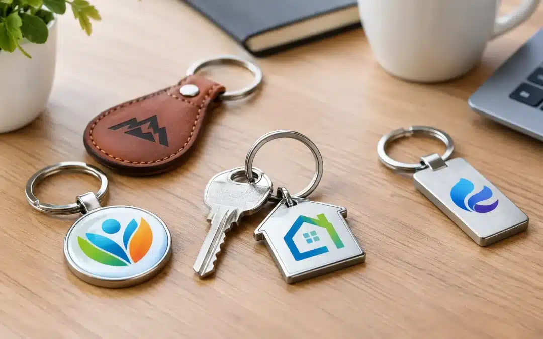
A keyring earns its place differently from a flyer or a one-day giveaway. It travels on house keys, car keys, office passes and ute keys, putting your brand in front of the owner repeatedly. Knowing how to design keyrings well means creating something people will genuinely keep, while making sure your logo remains clear, durable and true to your organisation.
For businesses, clubs, schools and event organisers, the best result starts before artwork is prepared. Consider who will receive the keyring, where they will use it and what action you want it to prompt. Those decisions guide the material, shape, decoration method and quantity far better than choosing a product on price alone.
Start with the job your keyring needs to do
A promotional keyring can be a practical customer giveaway, an item for club members, a retail souvenir, a staff recognition piece or a useful addition to a welcome pack. Each purpose calls for a slightly different design.
A real estate agency may want a lightweight, useful keyring that keeps its name and phone number close after settlement. A sporting club may prefer a stronger metal piece that feels like a membership keepsake. A school event could choose colourful plastic or soft PVC keyrings to suit a tighter budget and a younger audience. For a trades business, a keyring with a torch, tape measure or bottle opener may offer practical value, provided the branding area is still easy to read.
The key is to avoid asking one item to do everything. A premium presentation piece and a high-volume event handout are different projects. Setting the purpose early helps you spend where it counts and avoid paying for features your recipients will not use.
How to design keyrings around your audience
Think about the person holding the keys, not only the logo you want them to see. If the recipient is likely to carry several keys, bulk and weight matter. A slim acrylic, plastic, leather-look or aluminium design may be more welcome than a heavy novelty shape. If the keyring is intended as a commemorative item, a solid metal finish, raised detail or custom shape can add perceived value.
Age, setting and frequency of use also matter. Bright colours and simple shapes work well for school, community and family events. Corporate clients often respond better to restrained finishes, such as brushed metal, black, silver, navy or leather-look materials. Hospitality venues can be more playful, especially when the keyring reflects a signature product, mascot or location.
There is also a practical question: will the recipient be likely to attach it to keys straight away? Keyrings that solve a small problem tend to stay in use longer. Bottle openers, trolley coins, torches, lanyard attachments and floating keyrings can all work well when they suit the audience. A useful feature should support the campaign, not crowd out the branding.
Choose a material that matches the message
Material affects cost, appearance, production time and the types of artwork that can be reproduced. It is one of the most important choices in the design process.
Plastic keyrings are an economical option for larger runs, promotions and event bags. They can deliver bright printed colour and are available in standard or custom shapes. Acrylic keyrings have a clean, modern appearance and suit simple logos, artwork and photographic designs, although fine detail still needs to be assessed at the final product size.
Metal keyrings offer a more substantial feel. They are often chosen for corporate gifts, automotive businesses, awards, member packs and commemorative merchandise. Options such as engraved, printed, enamel-filled or plated finishes can create a professional result, but metal designs may carry higher unit costs and require more considered artwork.
Soft PVC is ideal for custom-shaped designs with strong colour blocks and a tactile finish. It is particularly effective for mascots, product outlines, club emblems and bold event branding. Leather-look materials bring a classic, premium feel, while bamboo or timber options can support a natural, considered brand presentation. The right choice depends on the intended use, budget and quantity, rather than which material appears most impressive in isolation.
Keep the artwork simple at keyring size
A keyring is a small branding space. Artwork that looks sharp on a business card, banner or website may lose detail when reduced to a few centimetres. Small type, fine lines, gradients and intricate logos need special care.
Begin with the strongest version of your logo. In many cases, this means using the logo mark and business name without a long tagline. If contact details are essential, prioritise one clear point of contact, such as a phone number or web address, rather than trying to fit every service and social media handle onto the item.
High-contrast artwork is easier to recognise at a glance. Dark print on a light background, or light print on a dark background, generally performs better than similar tones placed together. If your organisation has strict brand colours, provide the relevant Pantone references or clear colour specifications so the finished product can be matched as closely as the material and decoration method allow.
Vector artwork is usually the best starting point for custom keyrings. Files such as AI, EPS or print-ready PDF allow logos to be scaled cleanly and are especially useful for engraving, embossing, custom moulding and detailed print processes. If you only have a JPG or PNG, it may still be usable, but the quality should be checked before production begins.
Make both sides work harder
Two-sided keyrings can be worthwhile when you have a clear reason to use both sides. For example, place the logo on one side and a phone number, QR code or short campaign message on the other. This can improve usefulness without making the front look overcrowded.
However, printing both sides adds cost and is not always necessary. For a simple brand-awareness campaign, a strong one-sided design can be cleaner, more affordable and more memorable. It depends on whether the second side adds practical value or simply adds more information.
Select shape and features with care
Standard shapes such as rectangles, circles, ovals and house shapes are often cost-effective and quick to produce. They are a sensible choice for straightforward branded merchandise, particularly when deadlines are tight or quantities are high.
Custom shapes can be very effective when the silhouette is instantly recognisable. A home builder might use a house outline, a mechanic could use a spanner shape, and a football club may choose a design based on its crest or mascot. The strongest custom shapes are simple enough to recognise from a distance and sturdy enough to withstand regular handling.
Avoid overly delicate edges, narrow protrusions or complex outlines unless the production method supports them. They can affect durability and may force a redesign. The same applies to add-ons such as bottle openers, torches and trolley coins. A feature is worthwhile when it gives the recipient a reason to retain the keyring, not when it makes the product awkward in a pocket or bag.
Plan quantities, budget and timing together
Unit pricing usually improves as quantities increase, but ordering too many can create unnecessary storage and dated campaign stock. Estimate distribution realistically. Consider your event attendance, customer foot traffic, staff numbers, membership list or expected lead volume, then include a modest buffer for late requests and future use.
Production time varies considerably. A standard printed keyring may be suitable for a shorter timeframe, while custom moulded PVC, die-cast metal or specialised finishes can require more planning. Freight, artwork approval and any changes after proofing should also be allowed for. If you have a launch date, trade show, school fete or annual presentation night, work backwards from the day the keyrings need to be in hand, not the day you intend to place the order.
Budget decisions should focus on cost per useful impression, not only the lowest unit price. A cheap keyring that breaks or is discarded quickly does little for brand perception. A well-chosen design that recipients carry for months can represent very good promotional value.
Approve a proof before production
Before production, review the artwork proof closely. Check spelling, phone numbers, logo version, colours, print position and scale. Confirm whether the keyring is shown at actual size, as this makes it easier to judge whether fine text will remain readable.
It is also worth checking the fitting, split ring and any moving parts. For keyrings with functional elements, ask how the feature will operate in normal use. A clear approval process prevents costly corrections and helps keep delivery on schedule.
ABC2000 can assist with product selection, artwork guidance and production coordination, making it easier to match the keyring to your brand, deadline and budget. A short conversation about your audience and intended use often saves more time than starting with a generic product choice.
The most effective keyring is not necessarily the flashiest one. It is the one that feels appropriate in the hand, makes your brand easy to recognise and gives its owner a good reason to keep it on their keys.